A Visual Critique of Warhol's Shot Sage Blue Marilyn, 1964
As time goes on, visual consideration of Andy Warhol’s ‘Marilyns’ seems to be a more and more valid pursuit. Shot Sage Blue Marilyn (1968) is the most emotionally rewarding one despite being a retread (the original being done in 1962) and disregarded by Warhol himself as being “dead art”.

Source image for Andy Warhol's Marilyn paintings. ©2022 The Andy Warhol Foundation for the Visual Arts, Inc. / Artists Rights Society (ARS), New York
In reality, it is very difficult to not consider this art within the context of its overwhelming fame. It is beyond pervasive. The rare physical encounter rewards the viewer by virtue of proximity and satisfies Warhol’s basic desire for what the work was supposed to do (be a conceptual remark). The sale price ($195M at Christie’s in 2022) also reinforces the vision with a deeply human sense of ownership. Removing these huge conditions to objectively receive the work takes a moment of adjustment.
Critically considering the Shot Marilyns series
Unlike the many other Marilyns, the Shot Marilyns series is confined and feel meaningfully related to each other. As a group of five canvases making up one series, you could imagine a day of shooting with Marilyn and these were the selects at the end of the day. The original photo was actually a promotional image for the film Niagara (1953).
Viewers can interpret a series of distinct emotional states by virtue of the color and shadows in the prints. Think of it like watching the clouds and seeing shapes in them. Andy Warhol had to choose the colors for each print, automatically imbuing different attitudes and atmospheres. For example, many people associate blue with sadness, and red with passion. Layer in the heavy impact of the black screen print and humans naturally search for recognizable patterns created by the incidental shadows, tones, and shapes. Eyes can suddenly look sunken, hair can look grayed, smiles can suddenly seem forced, all by effective use of color and shadow.
With rich oranges and clear eyes, the most vital print (as if done first thing in the morning) is certainly Shot Orange Marilyn. Her composition is bright with color defining her face is fair-toned and fresh. Her hair is golden and the atmosphere is imbued with positivity. Everyone was ready for her.


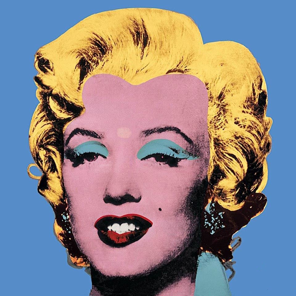

But by the time Sage Blue is finished, she is exhausted, or maybe even alien. Relative to Blue and Red, the background is faded. Maybe it is midnight or later. The blue is muddled and not confident in tone, uncommitted to any hue. The shadows are heavier than ever, the corners of the canvas and face feel cloaked in dust, as if she’d walked through a coal mine before returning from lunch.
With the dark lips, the smile is feigned and strangely geometric and unlike in Orange, we are awarded no sense of joy. The smile is a bit heartbreaking. She smiles as if taking direction from a textbook. She smiles like she’s just bitten into something deeply bitter. The makeup artist has all but given up. The blue eye shadow applied by Warhol (not present in the reference photo and not even the darkest application in the series) sits heavy and looks wet to this day. It is almost clown-like; creating an optical illusion of her eyes being even more sunken by virtue of scholarly application of tonal color. Her eyelashes and the wash of shadow merge at the corners of her eyes, reinforcing the misery. She is cartoonishly dazed, with her eyes seemingly going in two different directions. She offers no recourse anywhere else in her face.

Andy Warhol (1928-1987), Shot Sage Blue Marilyn, 1964 (detail)
Her smile feels stale and with lipstick flooding outside her actual lip line- almost insultingly unkempt and imprecise. It is the antithesis of what Marilyn represented. The lighting team has essentially left the building. The crop of the image, where her plunging dress is minimized to a corner of the collar suggests a woman drowning or on her tippy-toes, an attempt to occupy an immovable frame for just a second or two. It is Marilyn at her lowest and most objectified.
By leveraging the viewers’ ability to assign meaning to certain colors and shapes, Warhol is able to create an emotionally diverse selection of Marilyns from a single print.
Note: this story was updated on 7 December, 2022. Changes included added context and grammatical clarity.